A Break From Play - Improvising Interfaces
This week, I’ve taken a small break from Play to work on developing an interface for the book exchange app that I’ve been working on. I have been working with Twitter Bootstrap and Divshot which I will describe in this post.
Twitter Bootstrap
Twitter Bootstrap is a framework for developing front-end interfaces for websites and web applications. It has been gaining a lot of popularity lately and it is (or at least seems to be) used by a number of high-profile websites such as NASA and CNN. After using it for the past few days, it’s easy to see why it is becoming so popular. With a basic understanding of HTML it is easy to use the framework by simply linking to the necessary CSS and JavaScript files in your HTML source. In a matter of minutes, you can start to build a responsive website that would otherwise take hours and would probably not play well with all devices.
Bootstrap is built based on a 12-column grid design which is described in some detail here. In some ways a grid system can be limiting, but that is not necessarily a bad thing. The grid design can help force some structure into your website which is definitely not a bad thing. However, if you need more flexibilty, Bootstrap also provides a fluid grid system.
Divshot
Divshot is an online interface builder which incorporates Twitter Bootstrap as well as Ratchet and Foundation which are two other front-end frameworks similar to Twitter Bootstrap. Divshot provides a drag and drop interface to add components to your webpage, as well as a source editor that allows you to edit the HTML and see changes in real time. So far, I have mixed feelings about Divshot. It is still in Beta and sometimes it shows. I think this method of interface building has a lot of potential and I definitely like the idea, but Divshot’s execution seems to be lacking some polish and fine tuning.
The drag and drop interface can be finicky at times. It was nice to have a simple way to add components to your webpage, but it wasn’t always easy to get the component in exactly the right spot. I often found myself manually editing the HTML in order to move a component to the right section or to get the divs to nest the way I wanted. I wouldn’t quite consider Divshot a WYSIWYG editor because it does still require a decent understanding of HTML and CSS to get everything to work the way you want. However, I think with some work, it can become a very powerful interface development tool. Maybe one day it will be fully WYSIWYG and it won’t require any HTML knowledge to create simple, responsive websites.
Book Exchange Interface
Before I get started explaining the interface that I’ve developed so far, I will be the first to admit that the design leaves a lot to be desired. I do not really have much experience with user interface design or anything along those lines. For now, I’m just trying to flesh out the functionality of the website.
Homepage
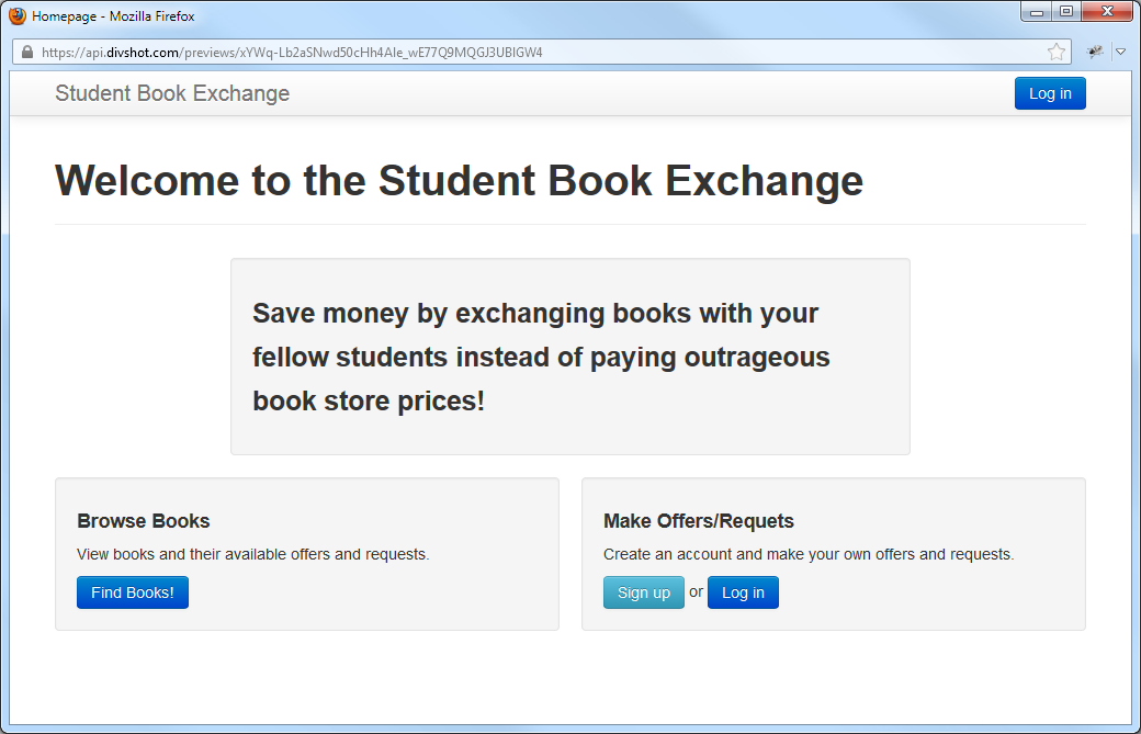 Here is a very bare bones home page. Obviously there a lot more I can do to improve it, but for now, I wanted to focus more on the other pages, which will provide much more user interaction.
Book List
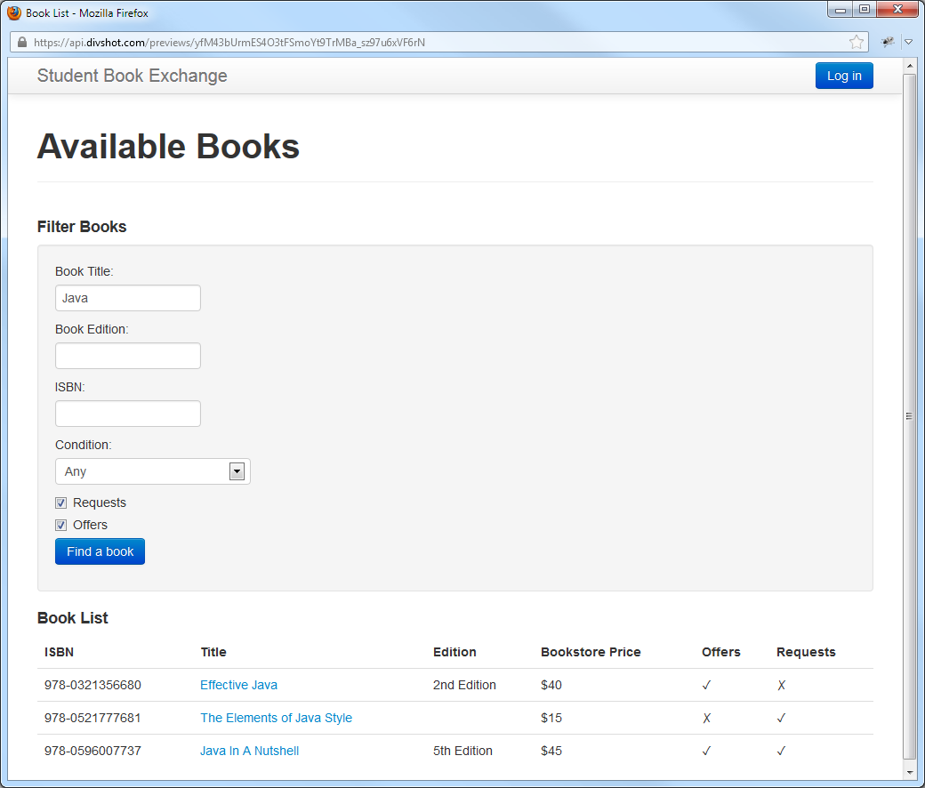 On this page the user can search for books with existing offers and requests. This will probably be the primary means of interaction with this site. A user would be able to filter their results based on title, price, condition, etc. Once they have a list of books, they can click on a book title and they will be taken to the page shown below.
View Book
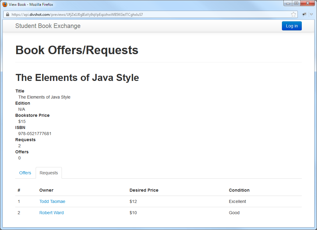 This is the view for a specific book. It lists the basic details about the book as well as the offers and requets available. A user can click on a name and they will be taken to the user’s profile, where they can view information about the other student. This information would include their contact information as well as their offer and request history so that a user can decide if the potential buyer or seller is trustworthy.
User Profile
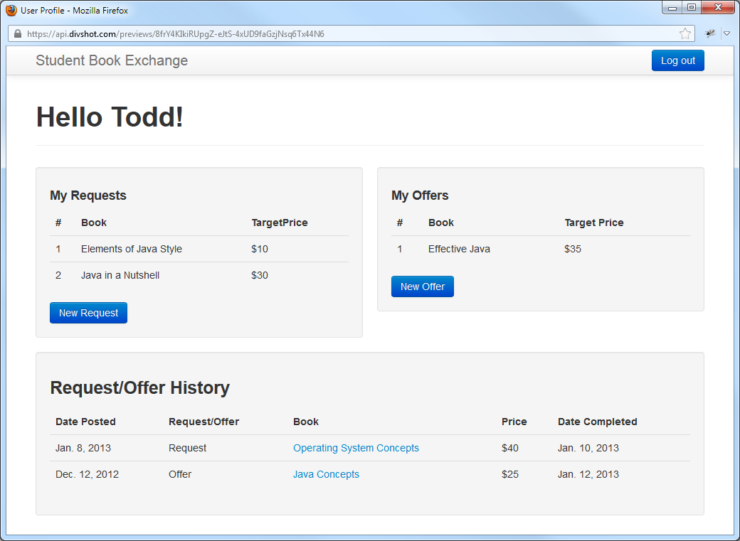 This is the view of a user’s profile, from that user’s prospective. If a user is viewing another user’s profile it would only include the Request/Offer History along with contact information.
Create Offer/Request
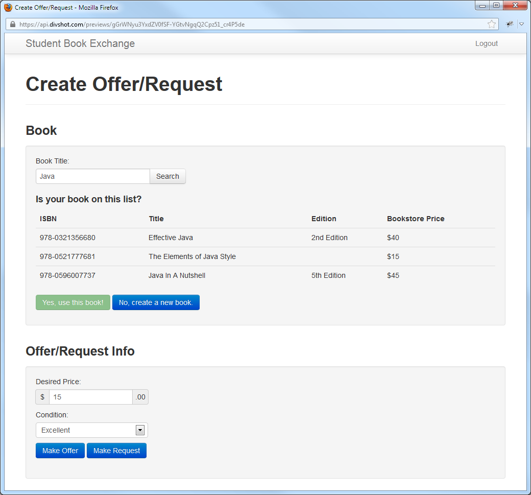 This is the page used to make a new offer or request. It allows you to search for a book that may have existing offers and requests. If the book doesn’t exist on the system, the user can create a new book to add to the system.
Create Book
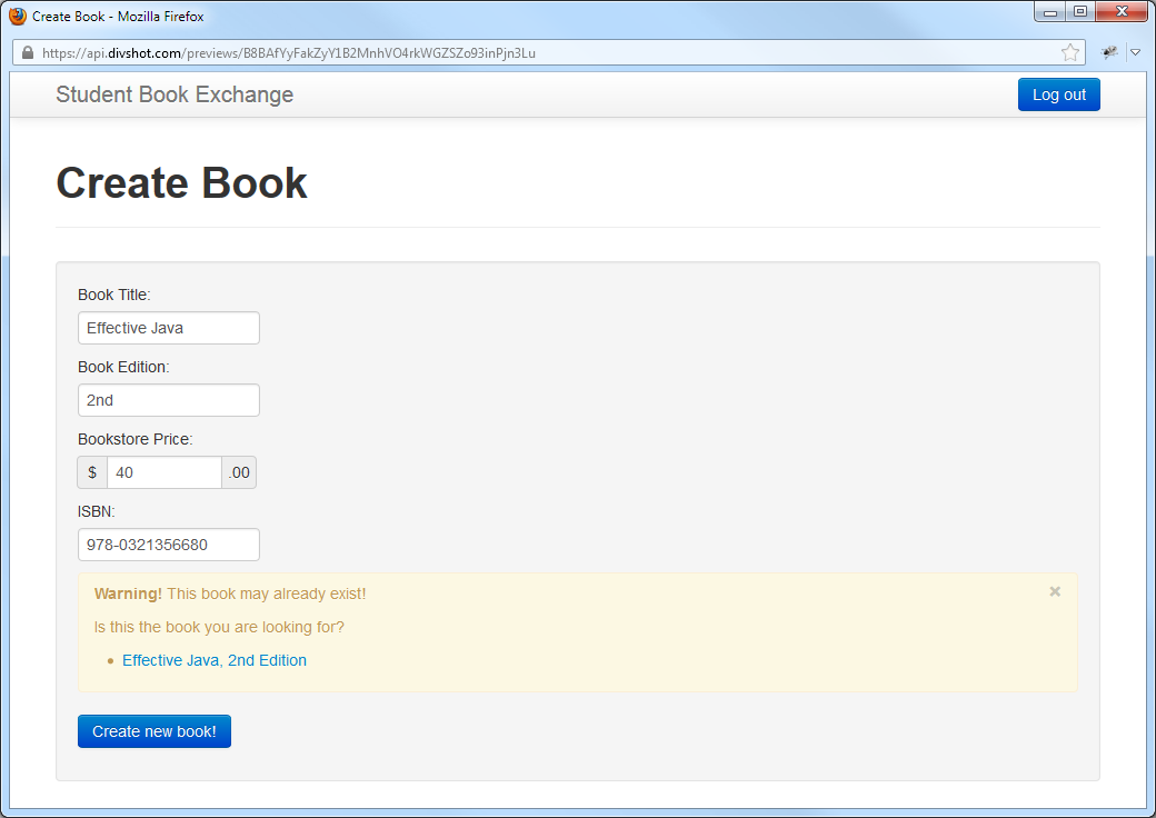 Here is how the user would add a new book to the system. As they enter information, the system will check if there may be a matching book and it will pop up a warning if it finds a potential match.
Reflection
There is obviously a lot of work to be done with the interface. For one thing, I’ll probably want to change it from the default design. Also, I’ve probably broken dozens of design and usability rules that I don’t know about. (Like I said, I don’t have much experience with user interface design.) However, I am pretty satisfied with my overall design. I think it provides the user with a fairly intuitive way to make and find requests and offers.
Next week I will work on incorporating this into Play. I am looking forward to actually having a semi-functioning web application. However, given the past troubles that Play has given me, I’m not looking forward to trying to get all of my ideas to actually work with Play.